Branding
Branding is the way a company can create an image for itself and in turn convey that message to its audience. This is in order for the purpose of a company to be immediately recognizable. A company’s branding should be able to appeal to their target demographic, communicate their purpose, and appear presentable and professional. A good way to do this is to use recognizable symbols and colors that associate with their desired purpose, and to use a lot of unity throughout the materials. In my brand, “Necropolis”, I used a limited color palette, repeated motifs and designs, and consistent themes to create that unity. My company is a toy company that sells dark, creepy, and cute stuffed animals, dolls, and other similar items. In order to show this, I created my logo to look like a teddy bear head that had been ripped off. This iconography makes my purpose recognizable, as it both says “cute” from the teddy bear, and “creepy” by the fact that it is ripped and has stuffing coming out. In order to make all my works feel as if they are from the same company I used a limited color palette. This makes all of them feel very cohesive and like they are meant to be together. As well as this, the colors I used, dark purples and pinks, have both cutesy and juvenile connotations, and at the same time more mature and mysterious connotations. This further pushes the message of my company on the audience.

|
Necropolis Brand Board
The selling point for my brand is that it sells creepy and dark plushes and accessories, as well as anything else under that category. Mainly the company would have a target demographic of teens and young adults who are into alt fashion or aesthetics. Dark colors immediately come to mind when thinking of this style, like black, red, purple. or blue. I chose purple as my main color and branched off of that with some fuchsia and pale yellow to add some variety. The pink gives the branding a bit of a cutesy touch as it is related to children's toys. The off-white acts as a warm contrast to the cool colors, as well as alludes to bones. I wanted my brand to give a sophisticated yet approachable feeling, so for typography I decided to choose a font that has both very fancy connotations with decorative serifs, while also being a bit edgy. The very sharp points and rough-around-the-edges vibe of Minnesota Winter felt perfect to me. |
|
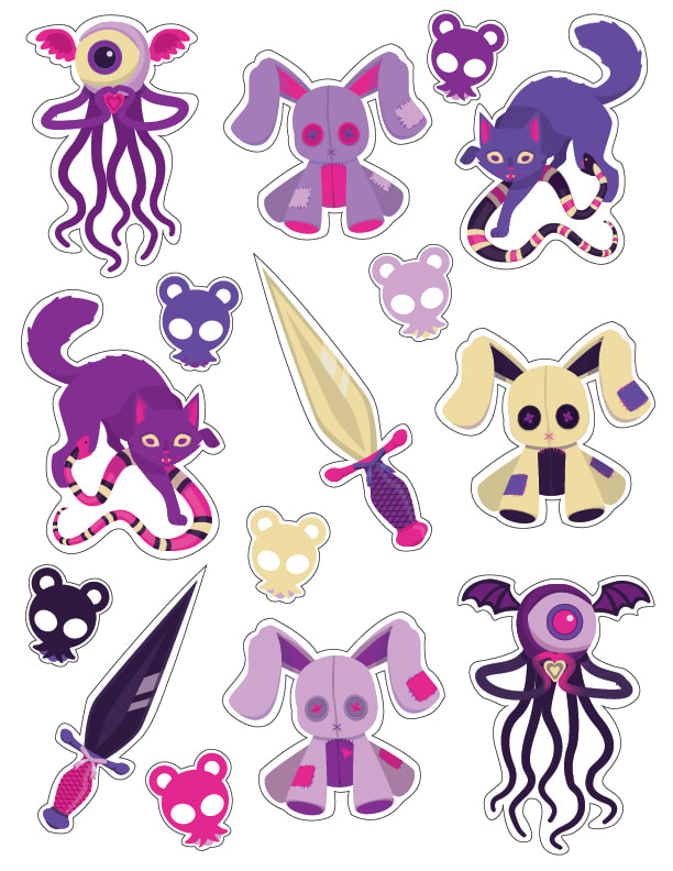
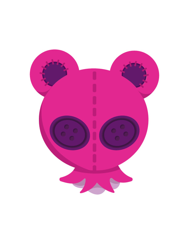
Logo and Stickers
My logo is a simplified representation of a teddy bear head that has been ripped. This appeals to both cute and creepy sides of my brand in a simple and easy to understand way. Each of my sticker design appeal to both cute and creepy sides of my brand as well. The nature of an eye-monster is creepy in and of itself, but the colors and pose makes it seem more cute. The stuffed bunny is similarly cute in and of itself, however the emphasis of including detailed button eyes with "X" shaped stitching gives it a more unsettling vibe. A cat being bit by a snake, and sharp daggers with bows and bright colors tie directly into this theme as well. |
|
|
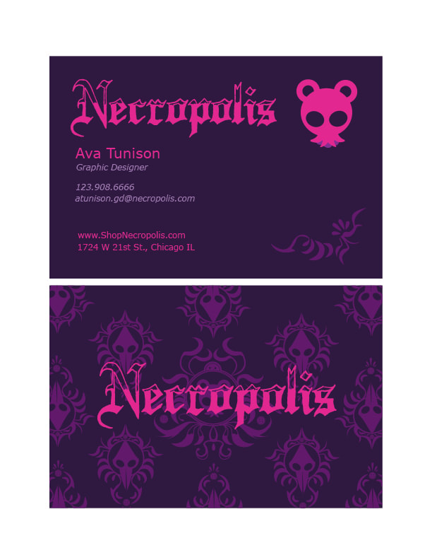
Business Card
Unlike stickers which mainly need to be decorative, a business card needs to both relate to the brand and be functional. I needed to find a combination of colors that makes the text pop, while at the same time not taking away from the feeling I am intending. For example, using the warm off-white color as a background would make the design feel warm and inviting which is not what I am going for. To go along with the font I chose, I created some intricate patterns to subtly put in the background as decoration. The design I created has both a beautiful aspect, while also have creepier elements and motifs from throughout my other body of work. This creates consistency, and relates to my company's message. |
|
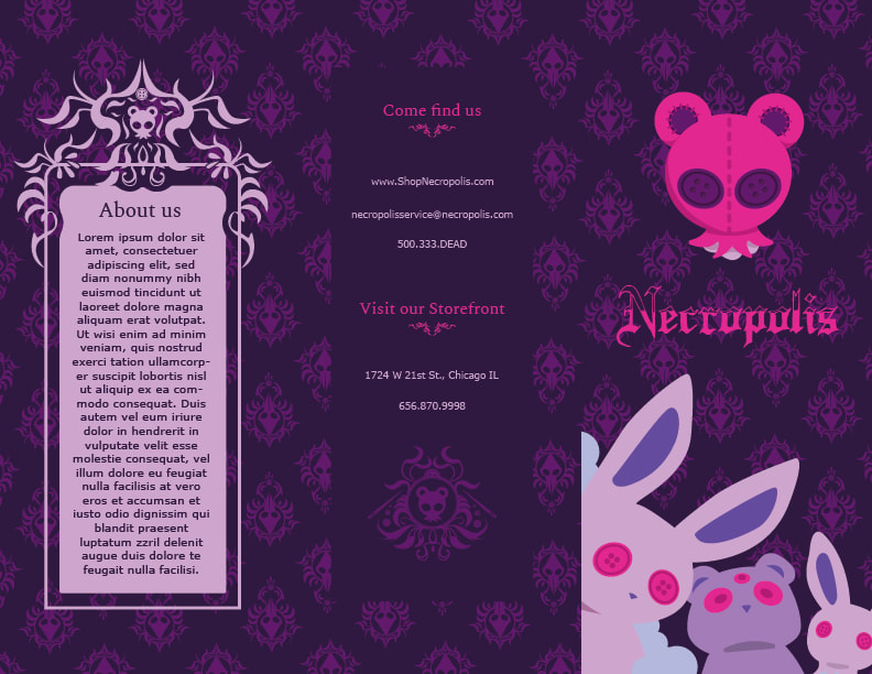
Pamphlet
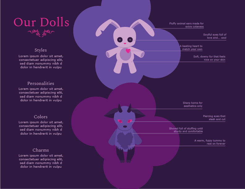
The pamphlet design relies heavily on the business card design, as the business card had laid out the main ledgers of my brand. I used the same pattern background on my pamphlet as my business card, as well as the same color fonts. This by itself cements my pamphlet as being unified with my business card and the rest of the brand. Beyond this, there were a few key elements I had to decide, one of the hardest and most important being what is the pamphlet's purpose. I decided to make the pamphlet provide information about what kinds of plushies, the company's main selling point, we sell. Therefore, the inside of the pamphlet would have lots of information in a visually appealing infographic style about what makes our plushes special. Another thing I needed to include was where to find the company, and what the company is about. that comes into play with the "about us" page and the "come find us" page. |
|
|
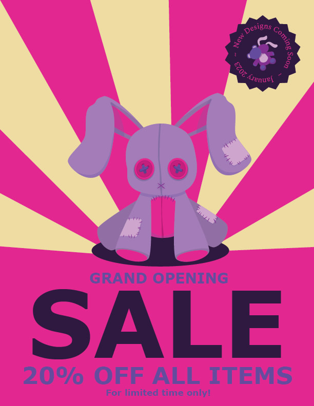
Poster
What was fun about making the poster design was that it needs to be very attention grabbing. This is unlike the business card and pamphlet because those are less reliant on grasping the attention of a random passerby to give information to, rather they most likely already have the viewers attention. therefore, I felt I couldn't use my usual color scheme of the similar shades of dark purple as the background, and instead opted for the brightest and most contrasting colors in my palette. The fuchsia and off-white contrast both the purple and each other very nicely. that way they don't feel out of place, but they do stand out. The radiating lines immediately draw the viewer towards the stuffed bunny picture and typography, so the viewer knows what we are trying to sell and why. I also really emphasized size contrast in this poster by making the word "sale" extremely large and a different color than the rest of the words. This makes great visual hierarchy because the most important word, and the word our customers will be most interested in, is "sale". |
|
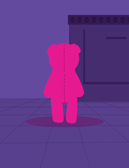
Mascot
My mascot design is a more detailed version of my logo. It is a teddy bear with button eyes that has been ripped apart from its body. Like the logo, this appeals to the ideals of my company in multiple ways. The actual subject matter is both cute and creepy. The color scheme is eye catching and juvenile, but in context it feels more mature. |
|
|
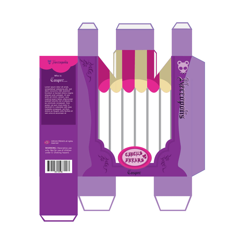
Packaging
For my packaging design, I aimed to make a package that would hold some kind of doll or plush. I took inspiration from other toy boxes, like Barbie dolls or other action figures you find find on shelf at a store. Therefore, my emphasis should be on the front of the box where the viewer would see the item. To make the item feel fun I gave the package a theme, and the doll a story. I imagined the toyline was called "Circus Freaks" and have a circus tent and cage bars. That way, the package will make the doll in the box appear to be locked behind a cage in a circus tent. Again, this appeals to the cute and creepy aesthetic. To add to creating a story, I named the hypothetical doll and made a place to put a bio for it. The idea is that giving the doll a personality and story will make people want to buy it more. |
|
Gif Animation
For the animation of my mascot, I wanted to create something supposedly creepy. Since the general public seems to have a fear of dolls coming alive, that is what my animation is about. The teddy bear mascot of my company comes alive, does some creepy stuff like turn its head 180 degrees and walking towards the viewer. The bear approaching the viewer can be interpreted menacingly, or perhaps as a loving embrace? |
|
